- Support Center
- Hours+
- Payroll Accountants
Hours+ Payroll Accountants: Timecards Screen vs. Reviews Screen
Check out all of our Hours+ courses in EDGE On-Demand.
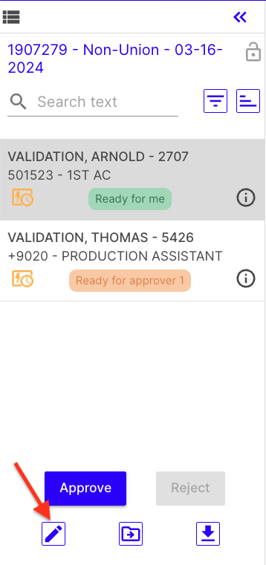
It's time to ditch the Reviews screen! As we get ready to sunset this page for Payroll Accountants, we want to make the transition as easy as ever. We’ve compiled some quick tips and tricks so you can work smarter in Hours+ with the Timecards screen.
Jump to a section in this guide
Timecards vs. Reviews Screen Differences
Timecards Screen Key Features
Bulk Edit
- Straight from the Weekly timecard screen, you can get to the bulk edit screen to make changes to lots of timecards at once

Ability to Customize
- You can actually do more on the Timecards screen with a customized layout.
- You can find, filter, and isolate timecards depending on important information, like weekending or employee name.
- You can even sort by account codes.
See More Details
- With the Timecards screen, you can see more details, such as what’s ready for you to review or what timecards haven’t been completed yet.
- The Timecards screen also provides more transparency as to where every timecard is in the workflow, even after you’ve reviewed it.
Fewer Clicks, More Info
- The Timecards screen gives you access to information that you won’t get on the Reviews screen. View comments, status, even last modified all in one place.
- Sort and filter by department without leaving the Weekly Timecard screen.
Timecards vs. Reviews Screen Differences
| Feature | Timecards Screen | Reviews Screen |
| Move timecards | ||
| Batch bulk-edit | ||
| Lock option | ||
| Download batch option | ||
| Filter departments and statuses | ||
| Find important details all on one screen | ||
| High-level information always available | ||
| Submit draft timecards | ||
| Add comments |
